The Client has decided that the color for the accent wall in the stairwell needs to be more of an accent. It doesn't jump out. It doesn't highlight. It's too subtle. It's matches too closely with the other wall color.
Really?

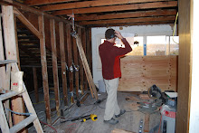
I know this photo has a certain
UFO quality to it, but I can still see the
Shrek-green on the right and the camel hair on the left. The Client correctly pointed out that the fact that I would have to be the one repainting it was impacting my judgment as to what constituted different enough. True enough, but I say the fact that she
doesn't have to repaint it leads to excess vacillation.
But no, the Client brought in her Sister with all her
design cred and they agreed: Go from
Shrek to
Toad.

But see? This still the before/not different enough shot. All we have to do is to equip anyone walking up the stairs with a flash and anyone can see the
accent wall clearly differentiated.
At least my weekend is setting up.
 To borrow a phrase from Michael Ian Black, this will totally blow your mind all over your face. Wall color drama over, drama about trim being too huge over, figuring our ladder logistics over.


